by Brent Dykes(Adobe) & Dieter Davis(Nike)
6 Tips for Better Data Visualizations
1.Identify the right data
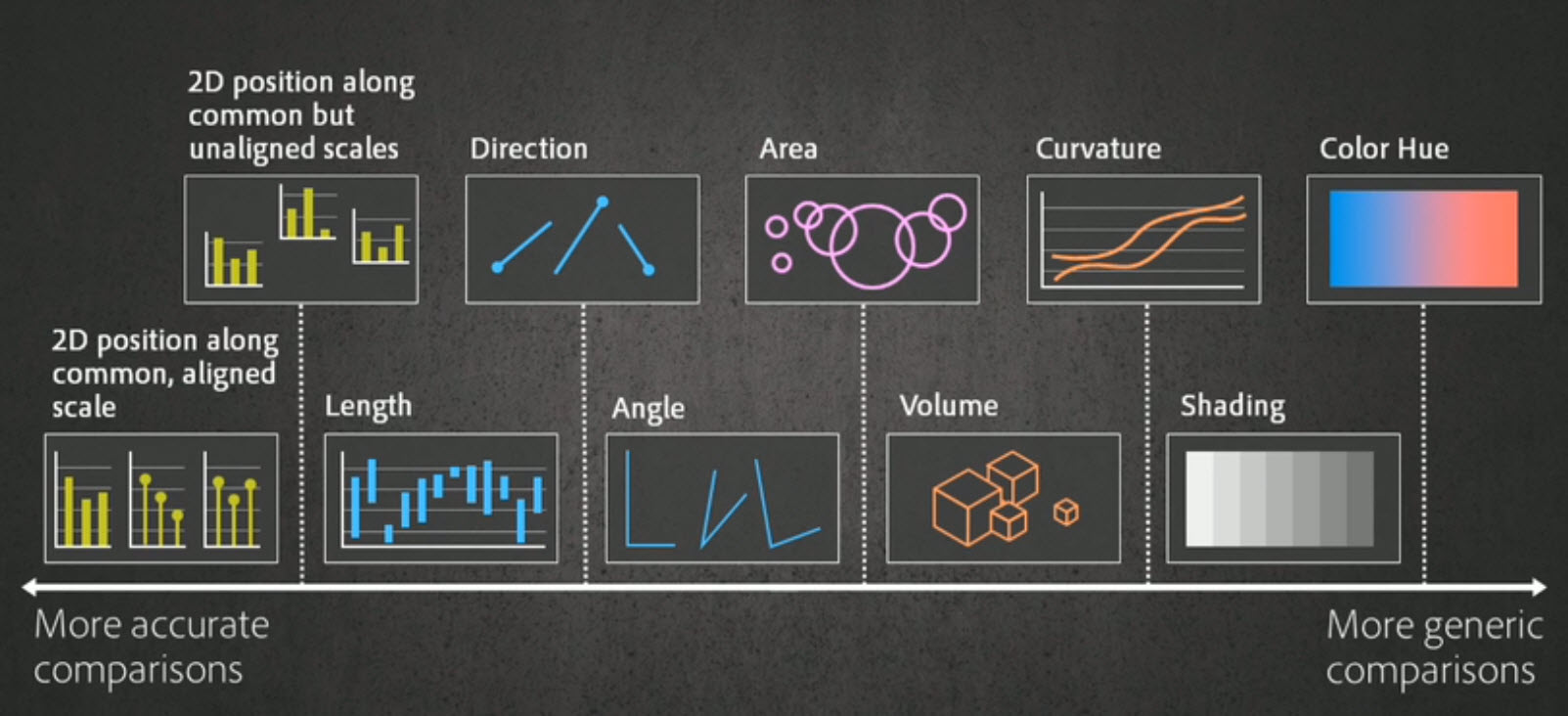
2.Choose the right visualization(s)
3.Calibrate visuals to your message
4.Remove unnecessary noise
No more than 4 lines in a line chart or use panel chart
No more than 5 slices in a pie chart
5.Highlight what’s important
6.Make it easy to consume
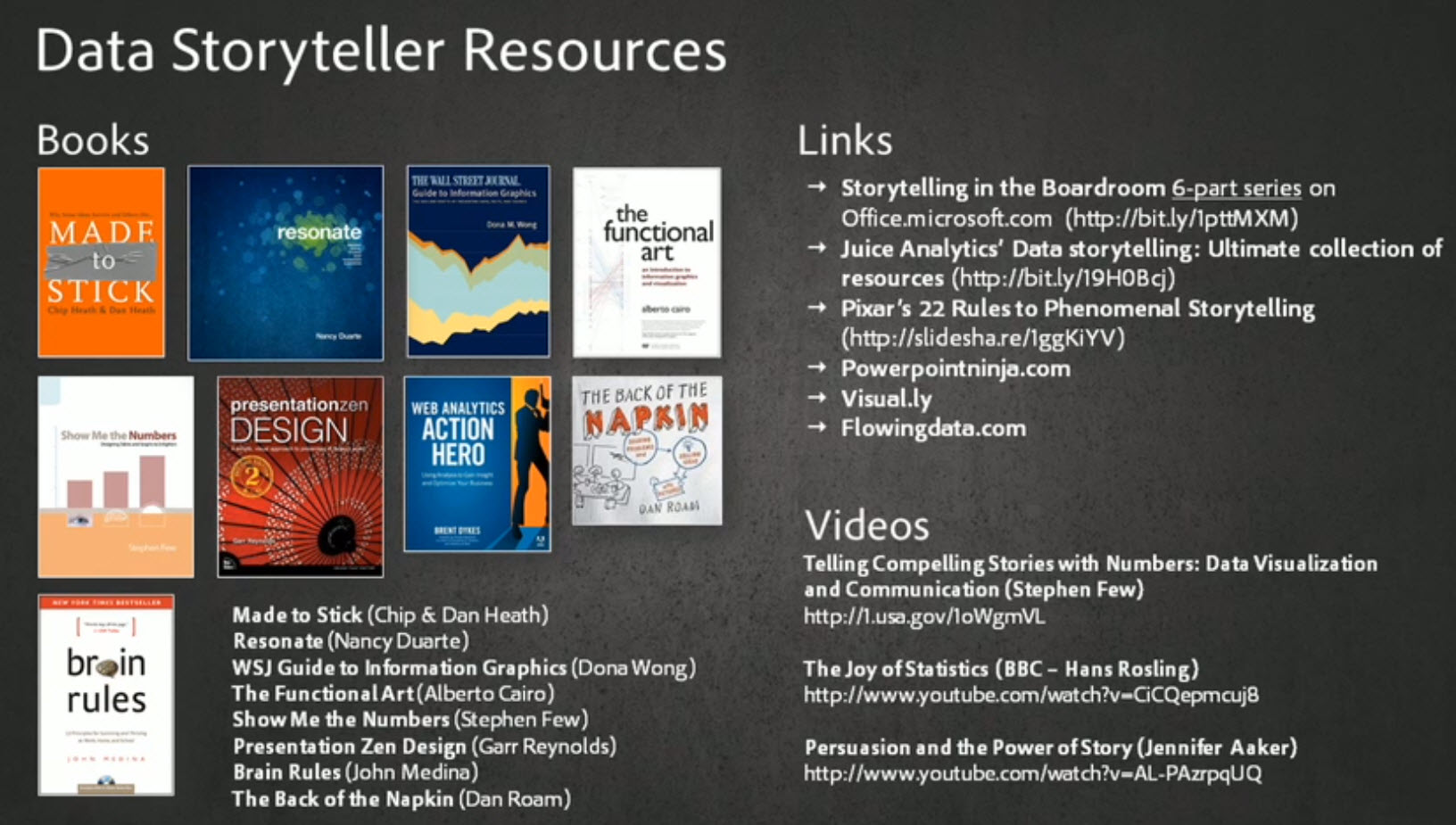
参考资料:


