
Paper: 2604.25914 Authors: Jinxiang Meng, Shaoping Huang, Fangyu Lei, Jingyu Guo, Haoxiang Liu, Jiahao Su, Sihan Wang, Yao Wang, Enrui Wang, Ye Yang Categories: cs.CL
The Gap
Existing data visualization benchmarks test agents in sanitized sandboxes: write Python code to generate a chart from clean CSV data, assume the user’s intent is crystal clear, and call it done. But real enterprise work looks nothing like this. Analysts work in Excel and Google Sheets, not Jupyter notebooks. They inherit broken dashboards that need diagnosis and repair. They get vague requests like “make it look better” and must probe for actual requirements. Prior benchmarks (ChartQA, PlotQA, MatPlotBench) focus on single-shot chart generation from perfect specifications—they ignore the messy lifecycle of professional visualization work.
Real-world gap:
  Sandbox confinement          Native environment grounding
       |                                |
       v                                v
  Code-only tasks    --->    Spreadsheet + code + repair
       |                                |
       v                                v
  Perfect intent     --->    Ambiguous requirements
       |                                |
       +--------------------------------+
                      |
                      v
              DV-World benchmark
                      |
       +--------------+--------------+
       |              |              |
   DV-Sheet      DV-Evolution   DV-Interact
   (native)      (adaptation)   (alignment)
       |              |              |
       v              v              v
   <50% performance across SOTA models
The Increment
One sentence: Before this paper, we tested visualization agents on toy chart-generation tasks; after, we have a benchmark that exposes their inability to handle real enterprise workflows involving spreadsheets, legacy code adaptation, and ambiguous user intent.
Core Mechanism
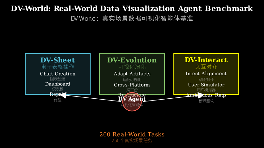
DV-World consists of 260 tasks split across three tracks that mirror professional visualization lifecycles. DV-Sheet (100 tasks) requires agents to manipulate native spreadsheet environments—creating charts and dashboards directly in Excel/Sheets, and diagnosing then repairing broken visualizations. DV-Evolution (100 tasks) hands agents a reference visualization artifact (Python/R/JavaScript code or a spreadsheet) and asks them to adapt it to new data, potentially requiring cross-language translation. DV-Interact (60 tasks) pairs agents with a user simulator that provides intentionally vague requirements, forcing the agent to ask clarifying questions before implementation.
DV-World architecture:

Input task --> Agent --> Action --> Environment --> Evaluation
                 |                       |              |
                 |                       |              |
         +-------+-------+       +-------+------+   +---+---+
         |       |       |       |       |      |   |       |
     DV-Sheet DV-Evo DV-Int   Excel  Python  R/JS  TvA  MLLM
         |       |       |       |       |      |   |       |
         v       v       v       v       v      v   v       v
    Create   Adapt   Clarify  Native  Code  Code  Num  Visual
    Repair   Restr.  Align    Env.    Env.  Env.  Acc. Sem.
Think of DV-World as a flight simulator for data visualization agents. Just as pilot training moved from textbook problems to full-cockpit simulators with engine failures and weather emergencies, this benchmark moves from “generate a bar chart” to “the CFO’s dashboard broke overnight and she needs it fixed before the board meeting.” The three tracks are different flight scenarios: DV-Sheet is flying the actual aircraft (native tools like Excel), DV-Evolution is transitioning between aircraft types (adapting a Matplotlib chart to work in R), and DV-Interact is dealing with air traffic control giving unclear instructions (ambiguous user requirements). Each scenario tests whether the agent has the operational competence to handle real professional turbulence, not just textbook maneuvers.
Key Concepts
-
Native environment grounding: Most benchmarks let agents write Python code that runs in isolation—a sandbox where the only tool is matplotlib and the only output is a PNG file. Native grounding means the agent must work inside Excel or Google Sheets, manipulating cells, formulas, and chart objects through the application’s actual API. It’s the difference between writing a recipe and cooking in a real kitchen with real pots and a temperamental stove. The agent can’t just output code and walk away; it must navigate the tool’s constraints, handle its quirks, and produce artifacts that live in the user’s actual workspace.
-
Cross-platform evolution: A company’s visualization assets accumulate over years in different languages and tools—Python scripts from the data science team, R code from statisticians, JavaScript dashboards from web developers, Excel templates from analysts. When new data arrives, someone must adapt these artifacts to fit. Cross-platform evolution tests whether an agent can take a Matplotlib chart and rewrite it in ggplot2, or convert an Excel dashboard to a Plotly web app, preserving the visual semantics while navigating completely different APIs and paradigms. It’s like asking a translator to not just convert words but maintain the rhetorical structure across languages with different grammars.
-
Proactive intent alignment: Real users don’t arrive with perfect specifications. They say “make the sales chart more insightful” or “the colors look off.” A passive agent asks “what do you want?” and gets stuck. A proactive agent recognizes ambiguity, generates hypotheses about what the user might mean (do they want a different chart type? different aggregation? different color scheme?), and asks targeted questions to narrow the space. The user simulator in DV-Interact mimics this by withholding information until the agent asks the right questions—testing whether the agent can drive the conversation toward clarity rather than waiting to be spoon-fed requirements.
Framework Shift
Before (mainstream approach):        After (this paper):

User intent (perfect)                User intent (ambiguous)
       |                                     |
       v                                     v
   Specification                      Clarification loop
       |                                     |
       v                                     v
   Code sandbox                       Native environment
       |                              (Excel/Sheets/Code)
       v                                     |
   Generate chart                            v
       |                              Create/Repair/Adapt
       v                                     |
   PNG output                                v
       |                              Artifact in workspace
       v                                     |
   Visual similarity check                   v
                                      Numerical + semantic eval
                                      (TvA + MLLM rubrics)

Single-shot generation          <->   Full lifecycle workflow
Isolated sandbox                <->   Real tool integration
Assumed perfect intent          <->   Negotiated requirements
From isolated chart generation to integrated workflow simulation, the core shift is treating visualization as a professional practice with messy inputs and native tool constraints, not a clean code-generation problem.
Expert Assessment
Problem choice: This is a real gap. Anyone who’s worked in enterprise analytics knows the chasm between “write code to make a chart” and “fix the CFO’s broken dashboard.” The authors correctly identify that existing benchmarks test a narrow slice of visualization competence. The three-track design (native tools, adaptation, intent alignment) maps cleanly to actual pain points in professional workflows. Not manufactured.
Method maturity: The benchmark design is solid but the evaluation framework shows seams. Table-value Alignment (TvA) for numerical precision is straightforward. MLLM-as-a-Judge with rubrics for visual semantics is pragmatic but introduces noise—the paper doesn’t deeply validate whether GPT-4’s aesthetic judgments align with human experts. The user simulator for DV-Interact is rule-based, which limits realism. A more mature approach would include human-in-the-loop validation of the simulator’s behavior and inter-rater reliability studies for the MLLM judge.
Experimental integrity: Baselines are fair—they test Claude 3.5 Sonnet, GPT-4o, Gemini 1.5 Pro, and open models like Qwen2.5-Coder. The <50% overall performance is striking and credible given the task difficulty. However, the paper doesn’t report variance across runs or provide error analysis showing *why models fail (is it API misuse? planning failures? inability to parse ambiguous intent?). The rubrics for MLLM evaluation are shown but not validated against human judgments. Numbers hold up but could use more scrutiny on failure modes.
Writing quality: The paper front-loads motivation well but rushes through technical details. Section 3 (benchmark construction) would benefit from concrete task examples earlier—readers shouldn’t have to wait until Section 4 to see what a DV-Sheet task actually looks like. The evaluation section conflates description of metrics with presentation of results, making it hard to parse. Rewriting Section 4 to separate “what we measure” from “what we found” would clarify the narrative. The related work section is thorough but could be tightened.
Verdict: weak accept — Real problem, useful benchmark, but evaluation framework needs validation and failure analysis is shallow. The contribution is the benchmark itself, not methodological innovation, and it succeeds at exposing a genuine capability gap in current models.
Takeaways
Practitioners building AI agents for data work can steal three things:
-
Native environment testing: Stop evaluating agents only on code generation. If your users work in Excel, test whether the agent can actually manipulate Excel, not just output Python that would theoretically work. The gap between “generates correct code” and “operates the tool” is larger than you think.
-
Clarification loops as a first-class capability: Don’t assume users will provide perfect specifications. Build and test the agent’s ability to recognize ambiguity and ask targeted questions. The DV-Interact track’s user simulator pattern (withhold information, reward good questions) is a template for testing this.
-
Cross-platform adaptation as a distinct skill: If your organization has visualization assets in multiple languages/tools, test whether agents can translate between them while preserving semantics. This is harder than single-language generation and requires different evaluation (not just “does it run?” but “does it convey the same information?”).
The broader lesson: benchmarks that ignore the messy reality of professional workflows will produce agents that fail in production. DV-World’s value is showing what “messy reality” looks like for data visualization.
论文: 2604.25914 作者: Jinxiang Meng, Shaoping Huang, Fangyu Lei, Jingyu Guo, Haoxiang Liu, Jiahao Su, Sihan Wang, Yao Wang, Enrui Wang, Ye Yang 分类: cs.CL
缺口
现有的数据可视化基准测试在无菌沙盒里测试智能体:写 Python 代码从干净的 CSV 数据生成图表,假设用户意图清晰明确,然后就算完成了。
但真实的企业工作完全不是这样。
分析师在 Excel 和 Google Sheets 里工作,不是在 Jupyter notebook 里。
他们继承需要诊断和修复的损坏仪表板。
他们收到模糊的请求,比如”让它看起来更好”,必须探查真实需求。
之前的基准(ChartQA、PlotQA、MatPlotBench)专注于从完美规范生成单次图表——它们忽略了专业可视化工作的混乱生命周期。
真实世界的缺口:
  沙盒限制              原生环境落地
       |                      |
       v                      v
  纯代码任务    --->    电子表格+代码+修复
       |                      |
       v                      v
  完美意图      --->    模糊需求
       |                      |
       +----------------------+
                |
                v
          DV-World 基准
                |
       +--------+--------+
       |        |        |
   DV-Sheet DV-Evo  DV-Int
   (原生)   (适配)  (对齐)
       |        |        |
       v        v        v
   SOTA 模型整体性能 <50%
增量
一句话: 这篇论文之前,我们在玩具图表生成任务上测试可视化智能体;之后,我们有了一个基准,暴露它们无法处理涉及电子表格、遗留代码适配和模糊用户意图的真实企业工作流。
核心机制
DV-World 包含 260 个任务,分为三个赛道,映射专业可视化生命周期。
DV-Sheet(100 个任务)要求智能体操作原生电子表格环境——直接在 Excel/Sheets 中创建图表和仪表板,诊断并修复损坏的可视化。
DV-Evolution(100 个任务)给智能体一个参考可视化制品(Python/R/JavaScript 代码或电子表格),要求它适配到新数据,可能需要跨语言翻译。
DV-Interact(60 个任务)将智能体与用户模拟器配对,后者提供故意模糊的需求,迫使智能体在实现前提出澄清问题。
DV-World 架构:

输入任务 --> 智能体 --> 动作 --> 环境 --> 评估
                |                  |         |
                |                  |         |
         +------+------+    +------+-----+   +---+---+
         |      |      |    |      |     |   |       |
     DV-Sheet DV-Evo DV-Int Excel Python R/JS TvA  MLLM
         |      |      |    |      |     |   |       |
         v      v      v    v      v     v   v       v
    创建  适配  澄清  原生  代码  代码  数值  视觉
    修复  重构  对齐  环境  环境  环境  精度  语义
把 DV-World 想象成数据可视化智能体的飞行模拟器。
正如飞行员训练从教科书问题转向带有引擎故障和恶劣天气的全驾驶舱模拟器,这个基准从”生成条形图”转向”CFO 的仪表板昨晚坏了,她需要在董事会会议前修好它”。
三个赛道是不同的飞行场景:DV-Sheet 是驾驶真实飞机(像 Excel 这样的原生工具),DV-Evolution 是在机型之间转换(将 Matplotlib 图表适配到 R 中工作),DV-Interact 是处理空中交通管制给出不清楚的指令(模糊的用户需求)。
每个场景测试智能体是否具备处理真实专业动荡的操作能力,而不仅仅是教科书演习。
关键概念
- 原生环境落地: 大多数基准让智能体编写在隔离环境中运行的 Python 代码——一个沙盒,唯一的工具是 matplotlib,唯一的输出是 PNG 文件。
原生落地意味着智能体必须在 Excel 或 Google Sheets 内部工作,通过应用程序的实际 API 操作单元格、公式和图表对象。
这是写菜谱和在真实厨房用真锅和脾气暴躁的炉子做饭之间的区别。
智能体不能只输出代码然后走人;它必须导航工具的约束,处理它的怪癖,并在用户的实际工作空间中生成制品。
- 跨平台演化: 一家公司的可视化资产在不同语言和工具中积累多年——数据科学团队的 Python 脚本、统计学家的 R 代码、Web 开发人员的 JavaScript 仪表板、分析师的 Excel 模板。
当新数据到来时,必须有人调整这些制品以适应。
跨平台演化测试智能体是否能将 Matplotlib 图表重写为 ggplot2,或将 Excel 仪表板转换为 Plotly Web 应用,在导航完全不同的 API 和范式的同时保留视觉语义。
这就像要求翻译者不仅转换单词,还要在语法不同的语言之间保持修辞结构。
- 主动意图对齐: 真实用户不会带着完美的规范到来。
他们说”让销售图表更有洞察力”或”颜色看起来不对”。
被动智能体问”你想要什么?“然后卡住。
主动智能体识别歧义,生成关于用户可能意思的假设(他们想要不同的图表类型?不同的聚合?不同的配色方案?),并提出有针对性的问题来缩小空间。
DV-Interact 中的用户模拟器通过隐瞒信息直到智能体提出正确问题来模拟这一点——测试智能体是否能推动对话走向清晰,而不是等待被喂食需求。
框架转变
之前(主流方法):              之后(本文方法):

用户意图(完美)                用户意图(模糊)
       |                             |
       v                             v
   规范说明                      澄清循环
       |                             |
       v                             v
   代码沙盒                      原生环境
       |                      (Excel/Sheets/代码)
       v                             |
   生成图表                          v
       |                      创建/修复/适配
       v                             |
   PNG 输出                          v
       |                      工作空间中的制品
       v                             |
   视觉相似度检查                    v
                              数值+语义评估
                              (TvA + MLLM 评分标准)

单次生成                <->   完整生命周期工作流
隔离沙盒                <->   真实工具集成
假设完美意图            <->   协商需求
从隔离的图表生成到集成的工作流模拟,核心转变是将可视化视为具有混乱输入和原生工具约束的专业实践,而不是干净的代码生成问题。
专家评审
选题眼光: 这是真缺口。
任何在企业分析中工作过的人都知道”写代码制作图表”和”修复 CFO 损坏的仪表板”之间的鸿沟。
作者正确识别出现有基准测试可视化能力的狭窄切片。
三赛道设计(原生工具、适配、意图对齐)清晰映射到专业工作流中的实际痛点。
不是人造的。
方法成熟度: 基准设计扎实,但评估框架显示接缝。
表值对齐(TvA)用于数值精度很直接。
带评分标准的 MLLM 作为评判者用于视觉语义是务实的,但引入噪声——论文没有深入验证 GPT-4 的美学判断是否与人类专家一致。
DV-Interact 的用户模拟器是基于规则的,这限制了真实性。
更成熟的方法会包括人在回路中验证模拟器的行为,以及 MLLM 评判者的评分者间可靠性研究。
实验诚意: 基线公平——他们测试了 Claude 3.5 Sonnet、GPT-4o、Gemini 1.5 Pro 和像 Qwen2.5-Coder 这样的开放模型。
整体性能 <50% 是惊人的,考虑到任务难度是可信的。
然而,论文没有报告跨运行的方差,也没有提供显示模型为什么失败的错误分析(是 API 误用?规划失败?无法解析模糊意图?)。
MLLM 评估的评分标准已显示,但未针对人类判断进行验证。
数字经得起推敲,但在失败模式上可以更仔细审查。
写作功力: 论文前置动机做得好,但在技术细节上仓促。
第 3 节(基准构建)会受益于更早的具体任务示例——读者不应该等到第 4 节才看到 DV-Sheet 任务实际是什么样子。
评估部分混淆了指标描述和结果呈现,使其难以解析。
重写第 4 节以分离”我们测量什么”和”我们发现什么”会澄清叙述。
相关工作部分很全面,但可以收紧。
判决: 弱接收 — 真实问题,有用的基准,但评估框架需要验证,失败分析浅薄。
贡献是基准本身,不是方法论创新,它成功暴露了当前模型中的真实能力缺口。
要点总结
为数据工作构建 AI 智能体的实践者可以偷走三样东西:
- 原生环境测试: 停止仅在代码生成上评估智能体。
如果你的用户在 Excel 中工作,测试智能体是否真的能操作 Excel,而不仅仅是输出理论上可以工作的 Python。
“生成正确代码”和”操作工具”之间的差距比你想象的大。
- 澄清循环作为一等能力: 不要假设用户会提供完美的规范。
构建并测试智能体识别歧义和提出有针对性问题的能力。
DV-Interact 赛道的用户模拟器模式(隐瞒信息,奖励好问题)是测试这一点的模板。
- 跨平台适配作为独特技能: 如果你的组织在多种语言/工具中有可视化资产,测试智能体是否能在它们之间翻译,同时保留语义。
这比单语言生成更难,需要不同的评估(不仅仅是”它能运行吗?“而是”它传达相同的信息吗?”)。
更广泛的教训:忽略专业工作流混乱现实的基准将产生在生产中失败的智能体。
DV-World 的价值在于展示数据可视化的”混乱现实”是什么样子。